
Yesterday I wrote about trying out Notice and Wonder Graphs with 4th grade teachers preparing for their unit on data. In yesterday’s post I wrote about how these teachers noticed, wondered, and drew conclusions about a bar graph entitled “More then half of Brits like pineapple on pizza”–an interesting, if not earth-shattering topic. But we didn’t want to only analyze graphs about pineapple and pizza.
I’ve noticed that in elementary school, at least, the data we collect and analyze often falls into the broad category of “interesting survey questions.
“Did you buy milk today?
“Who is your favorite Pokemon character?”
“Do you prefer winter or summer?”
And, of course, “do you like pineapple pizza?”
I don’t think these kinds of survey questions are bad! However, I think that if this is the ONLY kind of data that students are exposed to, they’re getting an incomplete picture of what data is and why it is useful.
Hoping to have a conversation around these ideas, I showed 4th grade teachers this series of images. Again, I asked them:
“What do you notice?”
“What do you wonder?”
“How does this new information change your thinking?”
First we looked at this:

Then we looked at this:
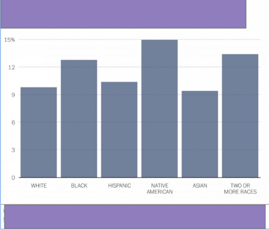
And finally, after thinking about the question, “Given what we know, what might be the title of this graph?” we looked at the unmasked graph:

We had lots of great conversations after looking at each image, but the most interesting came when we were trying to make sense of the full graph image.
The subtitle of the graph says “Percent of drivers pulled over by police in 2011, by race. We wondered: does that mean that this graph represents all people pulled over by police in 2011 and each bar is the percentage of those total people people pulled over? But then someone pointed out that the bars only add to about 70%. We also noticed that the bar representing Native Americans was the highest. That seemed surprising considering that Native Americans represent a pretty small percent of our overall population. (My quick googling said 2% in 2014.) Could more Native American people be being pulled over than black people? Something seemed off in our interpretation.
We realized we needed to go back to the source of this graph, a report from the Justice Department. Reading into the report, this was our new understanding of the data. The graph is based on a survey with people who had “involuntary contact” with the police in the last year (2011, in this case). Of these people (grouped by race in this graph), the percents on the graph represent the people whose “involuntary contact” was a traffic stop. The report summarized that “Relatively more black drivers (13%) than white (10%) and Hispanic (10%) drivers were pulled over in a traffic stop during their most recent contact with police. There were no statistical differences in the race or Hispanic origin of persons involved in street stops” (1). (Does this jive with your interpretation of the data? I’m open to the idea I misinterpreted it or didn’t understand something!)
Really making sense of this graph required a good amount of work for us, as teachers, and this routine support the slowing down of our thinking. The topic of this graph helped us discuss the idea that data is a way of investigating our world. We wondered about the kinds of data and graphs we could have students interact with around social justice and civil rights issues. We talked about giving kids data about important issues with which to grapple. Racism. Sexism. Climate change. Kids are thinking about these issues. Some of the amazing children’s literature out there helps kids consider these ideas in age appropriate ways. How can we do this with math too?

Please create more of these! Or please teach us how to take apart a graph like that so I can do it too! This is so awesome and can be so useful in really brining the world into mathematics. I teach Algebra 1 but I cannot wait to try and do this with my kids!
Katie,
I’m so glad your seeing connections to what you do with your older students! I’m sure there are fancier ways of putting these together, but I just plop a graph into a google slide and then put text boxes over the information I’m trying to hide. And then duplicate the slide and remove the text boxes I want to uncover. I’d love to hear about what you try out!